Moo Cards
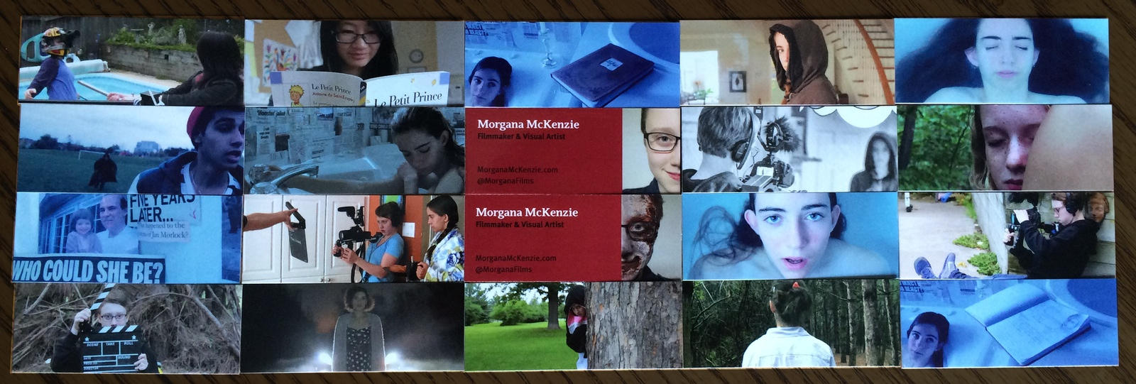
My Moo Mini Cards
NFFTY 2014 is coming up fast, and it’s very difficult for me to contain my excitement. Another reason that I’m excited, is my Moo mini-cards (several boxes) came in the mail the other day! Moo is a service for creating business cards that you can style and change to fit your business and personality. I styled mine so that each mini-card had a different frame from one of my films on the back, and of course all my important info on the front.
Moving Pictures
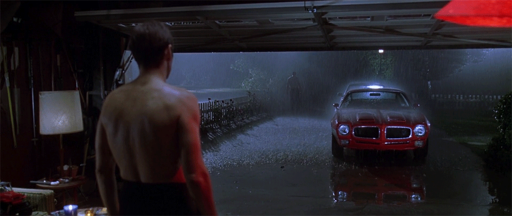
My family and I watch movies often, and we usually take turns on weekends picking which film we’re going to watch next. A couple weeks ago, my Mom picked “American Beauty” by Sam Mendes (brief note, if you haven’t already seen American Beauty, stop reading and go watch it). I had never seen it before, and wasn’t really sure what to expect.
As we watched the film, I slowly began to realize the beauty, framing, and symbolism in each of the shots. I already had a wide knowledge on the beauty of shots, but after watching American Beauty, I truly understood how individual shots can be a form of visual art in themselves.
When I say “a form of art”, I mean that its more than adding in an indulgent filler shot, or just framing it in a certain way to fit the overall scenery in. I mean that each shot is almost like a painting; each composed differently and meticulously, and different colour palettes used to symbolize different things. Films were originally called “moving pictures”, and especially with American Beauty I feel that each shot is like a different painting, or picture, in itself.
Here are some of my recent favourite examples of shots when it comes to specific colour selections, and the framing. By the way, some of these are “cinemagraphs“.

American Beauty
American Beauty
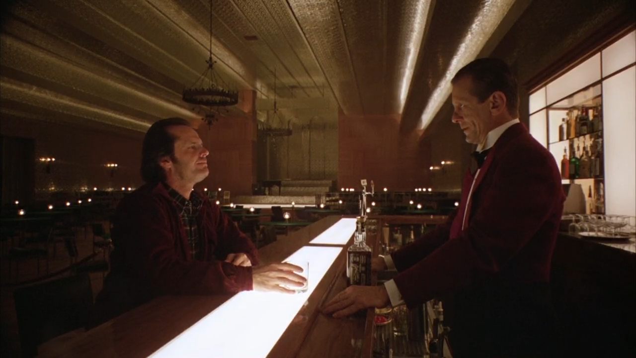
The Shining
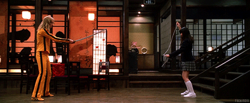
Kill Bill Vol. 1
In Gifts, I did have the knowledge of using specific colour palettes to provide different feels. So I made all the scenes with the character “Jan” more blue than anything else, whereas her visions were colourful. This shows the sort of feeling that Jan experiences all the time in her world: a blue, sad, and gloomy colour. In her visions she doesn’t feel or see that blue colour because she is seeing someone else’s much happier life (even in a murder situation).
The reason for blabbering on and on about this, is that for my next two films I am really going to focus on story boarding shots, selecting colour palettes, framing and composition, wardrobe and makeup. I really want to better achieve that feel something that isn’t just a film — but a series of moving pictures, or paintings.
This is going to be fun!